Have you ever walked into a room and instantly felt calm—without quite knowing why? Or stared at a painting and noticed how effortlessly the colors seemed to belong together? Chances are, you were experiencing the quiet power of analogous colors. These are the color combinations that feel almost too natural, too soothing—and once you understand how they work, you’ll start spotting them everywhere, from autumn forests to the most stylish apartments on Pinterest.
Understanding what analogous colors are isn’t just an art-school concept. It’s a practical skill that changes the way you decorate your home, design a brand, choose an outfit, or compose a photograph. Whether you’re a designer, a homeowner, or simply someone who cares about how spaces and visuals feel, mastering the analogous color scheme will give you a reliable tool for creating beauty that never feels overdone.
In this guide, we’ll break down everything: the definition, the theory behind the analogous color wheel, stunning real-world examples, and exactly how to apply an analogous color scheme in interior design and beyond. Let’s dive in.
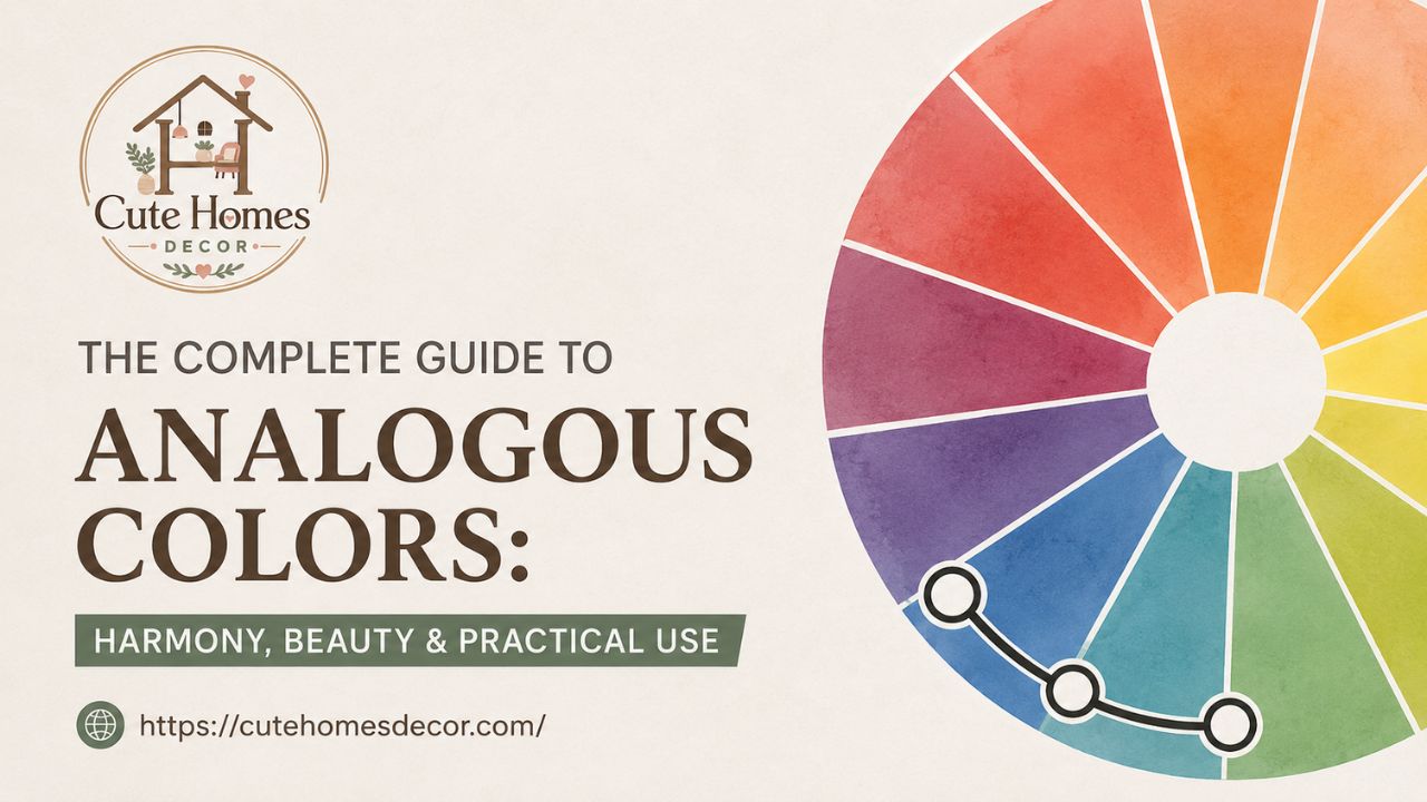
The color wheel makes analogous relationships immediately visible — neighboring hues within a 60° arc create natural, effortless harmony.
What Are Analogous Colors? A Clear Definition
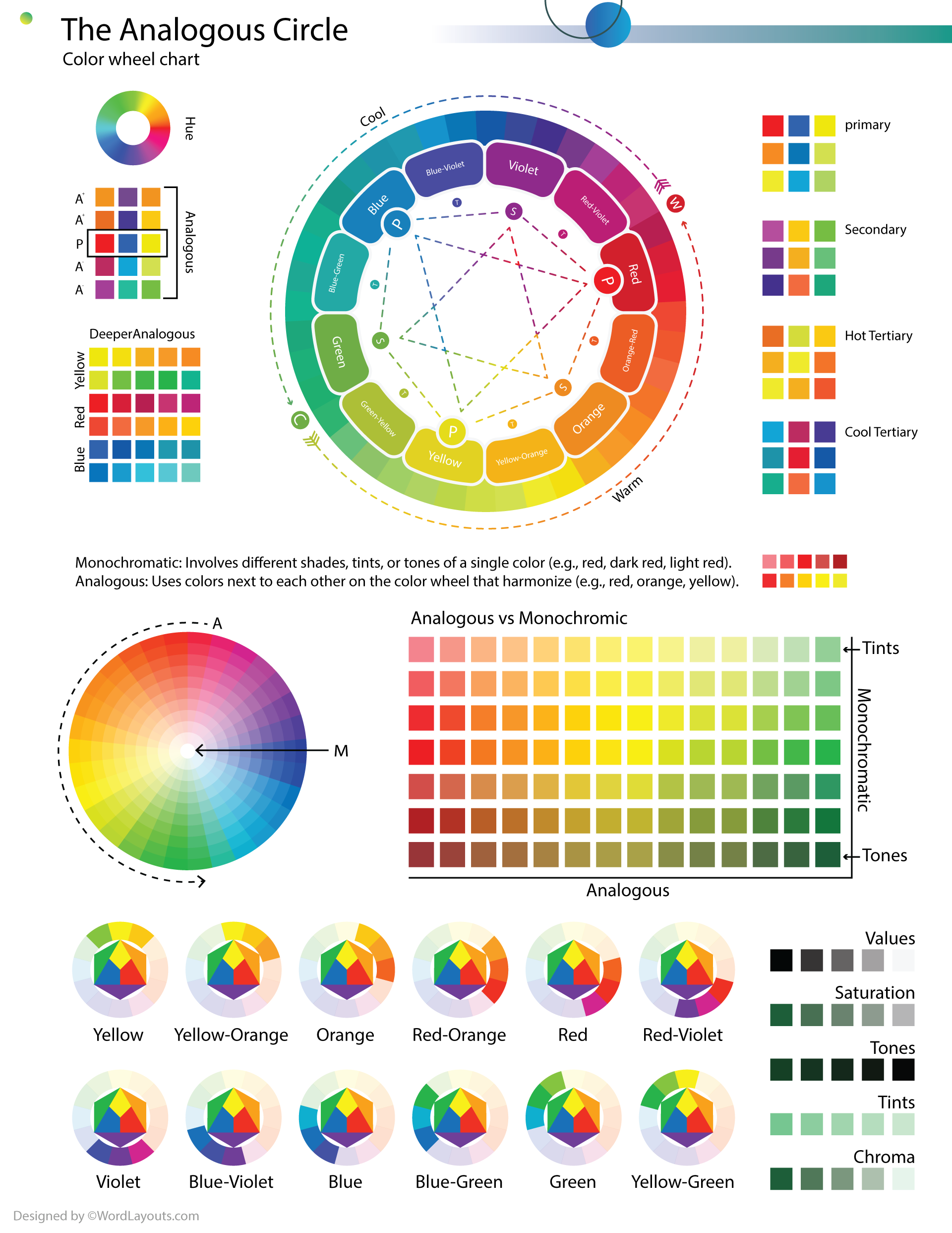
Let’s start at the foundation. Analogous colors are groups of three to five colors that sit directly next to each other on the color wheel. The word “analogous” literally means “similar” or “corresponding”—and that’s exactly what these colors are. They share a common hue base, which is what gives them their naturally unified, harmonious feel.
Think of a standard 12-part color wheel. If you place your finger on any single color—say, blue—and then look at the two or three colors on either side (blue-green and blue-violet, for example), you have a classic analogous colour scheme. They’re neighbors on the wheel, not opposites, which means they don’t fight for visual attention the way complementary colors do.
“Analogous colors are nature’s default palette—they’re everywhere in the world around us, from a peacock’s feathers to the gradient of a late-afternoon sky.”
The analogous color harmony works because adjacent hues on the wheel share pigment undertones. When placed together, they create smooth visual transitions rather than jarring contrasts. This is why designers, painters, and decorators reach for the analogous color scheme whenever they want a result that feels cohesive, serene, and intentional.
The Analogous Color Harmony: How It Works on the Color Wheel
On a standard RYB (Red-Yellow-Blue) color wheel used in traditional art and design, colors are arranged so that related hues sit side by side. An analogous colour scheme typically spans about 30–60 degrees of the wheel’s arc. Within that arc, you’ll find three key elements:
- A dominant color — the one that takes up the most visual space.
- A supporting color — an adjacent hue that adds depth and dimension.
- An accent color — the third hue that provides just enough contrast to keep things interesting.
In the world of color theory analogous combinations, this three-part structure is sometimes called the 60-30-10 rule: 60% dominant, 30% supporting, 10% accent. It’s the same rule used in interior design, graphic design, and even fashion styling—and it’s one of the reasons the analogous design approach feels so polished.
What Is the Analogous Color Scheme Meaning in Art?
In art history and painting, the analogous color scheme meaning runs deep. Impressionist painters like Claude Monet were masters of analogous colour usage—think of his water lily series, where greens, blue-greens, and teals blend seamlessly across the canvas. The result isn’t just beautiful; it creates a mood, an atmosphere, a sense of place.
The analogous meaning in art extends beyond mere aesthetics. Artists use these schemes deliberately to guide the viewer’s eye, to suggest time of day or season, and to evoke emotional states. A palette built from warm analogous colors—reds, oranges, and yellows—feels energetic and passionate. A cool analogous palette of blues, blue-greens, and teals feels meditative and calm.
Analogous Colors Examples Across the Spectrum
One of the best ways to truly understand what are analogous colors is to see them in action. Here are some of the most commonly used and visually striking analogous colors examples from across the color wheel:
| Group Name | Hues Included | Mood / Feel |
| Warm Sunset | Red, Red-Orange, Orange | Energetic, passionate, bold |
| Golden Hour | Orange, Yellow-Orange, Yellow | Warm, cheerful, inviting |
| Forest Canopy | Yellow-Green, Green, Blue-Green | Natural, refreshing, serene |
| Ocean Depth | Blue-Green, Blue, Blue-Violet | Calm, professional, trustworthy |
| Twilight Sky | Blue-Violet, Violet, Red-Violet | Luxurious, mysterious, creative |

An autumn forest is nature’s most perfect warm analogous palette — reds, red-oranges, and golden yellows flowing together without a single clash.
Blue Analogous Colors: A Designer Favorite
Among all the groups, blue analogous colors are perhaps the most widely used in professional design. A palette anchored in navy or cobalt, then extended into teal and blue-violet, communicates sophistication and reliability. You see it in corporate branding, healthcare design, and high-end interior spaces.
The power of a blue analogous color scheme lies in its ability to feel both restful and professional simultaneously. Interior designers frequently use it in bedrooms and home offices because it doesn’t overstimulate while still feeling polished and considered.
Red and Green Analogous Colors in Nature
Some of the most inspiring analogous colors in nature come from looking at red groupings (red, red-orange, orange) or green analogous colors (yellow-green, green, blue-green). A maple tree in autumn displays a perfect warm analogous palette. A tropical rainforest showcases the cool green side. These natural analogous colors examples are a reminder that this color system isn’t invented—it’s observed.
ANALOGOUS COLOR SCHEME — VISUAL PALETTE GUIDE
WARM PALETTE: Red → Orange → Yellow
| Red | Red-Orange | Orange | Yel-Orange | Yellow |
COOL PALETTE: Blue-Green → Blue → Blue-Violet
| Blue-Green | Teal | Blue | Navy | Blue-Violet |
Rule: Use 3–5 adjacent hues spanning ~60° of the wheel | Proportion: 60% dominant · 30% supporting · 10% accent
Analogous Color Scheme Interior Design: Room-by-Room Guide
Nowhere is the analogous color scheme more transformative than in interior spaces. An analogous color scheme room feels pulled-together and serene in a way that’s hard to achieve with more contrasting palettes. The secret is that the eye doesn’t have to work hard to reconcile clashing hues—it simply relaxes into the flow of related tones.
Analogous interior design is built on layering. Rather than placing solid blocks of color next to each other, skilled designers weave hues together through upholstery, paint, textiles, art, and accessories. The result is a room that feels rich and intentional without feeling loud.
Analogous Color Scheme Living Room Ideas
The living room is where analogous color scheme interior design truly shines. Consider a palette of warm terracotta, burnt orange, and golden yellow. Paint the walls in a muted warm beige (the foundation), bring in a terracotta sofa, layer burnt-orange throw pillows, and finish with golden-yellow cushions and a mustard area rug. The result? A living space that feels like a Mediterranean evening—warm, welcoming, and incredibly livable.
For a cooler analogous color scheme living room, try pairing sage green walls with blue-green accents in artwork, dusty teal upholstery, and muted aqua ceramics on the shelves. This kind of cool analogous room design works beautifully in spaces that get a lot of natural light.
Analogous Color Scheme Bedroom Inspiration
The analogous color scheme bedroom is perhaps the most intuitive application of this theory, because bedrooms are spaces designed for rest. Cool analogous palettes—lavender, soft violet, and dusky blue—create an atmosphere of quiet luxury. Warm analogous schemes—blush pink, dusty rose, and warm mauve—feel romantic and cocooning.
In an analogous bedroom, the key is to vary the value (lightness and darkness) of your chosen hues as much as you vary the hues themselves. A room that uses all mid-tone colors in the same analogous family can feel flat. Instead, reach for a very light version of one hue (perhaps a near-white blush for the walls), a mid-tone for the bedding, and a deeper, richer shade for an accent piece like a velvet headboard or a statement bench at the foot of the bed.
Analogous Colors in Interior Design: Practical Tips
When applying analogous colors in interior design, keep these principles in mind:
- Start with a hero color. Choose the hue you love most and build outward to its neighbors on the wheel.
- Include neutrals. White, cream, gray, and wood tones act as breathing space between analogous hues, preventing the palette from feeling heavy.
- Use texture to differentiate. When colors are similar in hue, texture becomes your contrast mechanism—linen against velvet, matte against gloss.
- Don’t forget the 60-30-10 rule. One dominant, one supporting, one accent keeps the analogous colour scheme from becoming monotonous.
- Test in your actual lighting. Colors shift dramatically under different light conditions. Always test paint swatches in situ before committing.
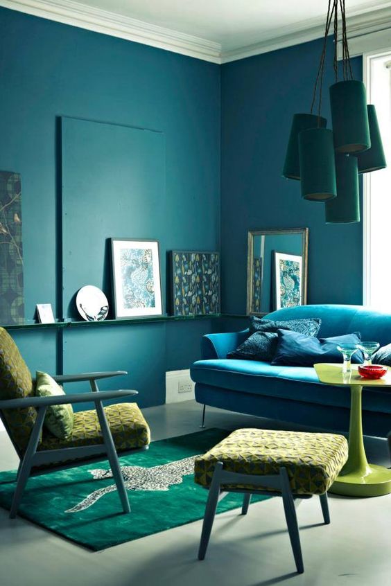
A beautifully executed analogous interior — sage greens, dusty teals, and muted blues layered through upholstery, textiles, and accessories for a serene, cohesive feel.
Analogous vs. Complementary Colors: What’s the Difference?
It’s worth taking a moment to understand how complementary colors and analogous colors differ—because they represent the two ends of the color harmony spectrum.
Analogous colours sit next to each other on the color wheel and share undertones, creating harmony and visual unity. Complementary colors sit directly opposite each other (like red and green, or blue and orange) and create high contrast and visual tension. Neither approach is better; they’re simply suited to different goals.
When you want energy, pop, and visual excitement, complementary colors deliver. When you want cohesion, serenity, and a sophisticated layered look, the analogous colour scheme is your tool. Many advanced designers actually blend the two approaches—using an analogous palette as the primary scheme and introducing a small complementary accent. This is sometimes called a double analogous color scheme or a split-complementary approach.
Analogous Color Harmony vs. Other Harmony Types
Beyond complementary, the other major color harmonies include triadic (three colors equally spaced on the wheel), tetradic (four colors forming a rectangle), and monochromatic (one color in varying shades). Each has its place, but analogous color harmony is unique in its approachability. It requires less precision than triadic or tetradic schemes and more visual interest than purely monochromatic palettes. It’s the harmony type most beginner and intermediate designers are encouraged to master first—precisely because it reliably produces beautiful results.
Analogous Color Scheme in Graphic Design and Branding
The analogous color scheme design principle is just as powerful in two-dimensional work as it is on a room’s walls. In graphic design and branding, analogous design creates visual consistency across a brand identity—logos, websites, packaging, and marketing materials all feel like they belong to the same family.
Consider how many successful tech brands use blue-heavy analogous palettes—ranging from cobalt to teal to periwinkle—to communicate trust, innovation, and calm efficiency. Fashion brands, on the other hand, frequently use warm analogous color palettes—from cream to sand to warm brown—to convey luxury and timelessness.
Using an Analogous Color Scheme in Logo Design
An analogous color scheme logo is particularly effective for brands that want to feel approachable and sophisticated simultaneously. The key is to choose a dominant brand color, then allow supporting analogous hues to appear in backgrounds, typography, and secondary graphic elements. This approach creates depth without the visual tension of complementary color combinations.
Analogous Colors in Web Design and UI
In user interface design, analogous color schemes are frequently used for data visualization, dashboard design, and app aesthetics. When displaying multiple categories of data, using analogous hues (rather than wildly contrasting ones) makes charts and graphs easier to read and more visually pleasant. The analogous colour palette keeps the visual experience cohesive even when there’s a lot of information on screen.
One crucial caveat for UI designers: analogous colours can reduce contrast, which creates accessibility challenges for users with visual impairments. Always ensure that text maintains sufficient contrast ratio against background colors—even within an analogous scheme—by adjusting value (lightness/darkness) even while keeping hue similarity.
Analogous Colors in Fashion and Styling
The principles of analogous fashion are the same ones at work in interior design—and they explain why some outfits look effortlessly put-together while others feel chaotic. A warm analogous outfit might pair a rust-orange blazer with a burnt-sienna turtleneck and amber-toned trousers. A cool analogous look could combine a slate-blue coat with a dove-grey sweater and navy jeans.
Analogous colors and shades in fashion work because they create a tonal outfit—a look where colors relate to each other so naturally that the overall effect is one of studied ease. Fashion stylists and personal shoppers often teach clients the analogous principle as a gateway to more sophisticated dressing, precisely because it’s so reliably flattering.
Warm Versus Cool Analogous Color Palettes in Styling
A warm analogous color scheme in fashion aligns beautifully with warm skin tones—golden, olive, and deep complexions are enhanced by oranges, reds, and warm yellows. Cool analogous palettes—blues, purples, and greens—tend to complement cool and neutral skin tones. Of course, personal style rules are meant to be played with, and analogous hues are flexible enough to work across virtually any skin tone when value (light vs. dark) is taken into account.
Common Mistakes When Using an Analogous Color Scheme
Even with such a forgiving color system, there are pitfalls that trip up beginners—and sometimes even experienced designers. Here are the most common mistakes when working with an analogous colour scheme, and how to avoid them:
- Using all the same value. When every color in your scheme is the same mid-tone brightness, the result looks flat and dingy. Always include a range from light to dark within your analogous palette.
- Forgetting neutrals. Analogous palettes need breathing room. White, off-white, grey, and natural wood tones prevent the scheme from becoming claustrophobic.
- Going too wide on the color wheel. If your “analogous” palette spans more than 90 degrees of the wheel, you’ve started to lose the harmony effect. Keep it tight—ideally within 60 degrees.
- Neglecting texture and pattern. Similar colors need contrast delivered through other means. Mix textures aggressively: matte and gloss, rough and smooth, soft and structured.
- No dominant color. Without a clear dominant hue, the scheme can feel indecisive. Commit to one anchor color and let the others support it.
Analogous Color Scheme Examples in Real Projects
Analogous color scheme examples in real-world design help make the theory tangible. Here are a few contexts where this approach excels:
Example 1 — Analogous Color Scheme Room in a Scandinavian Interior
A Scandinavian-inspired living space built on a cool analogous palette: soft white walls (the neutral anchor), muted sage green upholstery, dusty teal throw pillows, and eucalyptus-green plants throughout. The analogous color scheme room feels serene and airy—a perfect example of how less truly can be more.
Example 2 — Warm Analogous Palette in a Restaurant Brand
A Mediterranean restaurant brand using terracotta, warm amber, and golden yellow across its logo, menus, and interior. The analogous color scheme design communicates warmth, tradition, and appetite appeal simultaneously—without resorting to the overused red-and-yellow of fast food branding.
Example 3 — Purple Analogous Colors in a Luxury Beauty Brand
A high-end cosmetics brand anchored in violet, with supporting hues in rose-pink and blue-purple. The analogous colors purple palette signals luxury, creativity, and femininity—and because the colors are harmoniously related, the overall effect feels sophisticated rather than garish.
Frequently Asked Questions
What are analogous colors, exactly?
Analogous colors are groups of three to five colors that appear adjacent to each other on the color wheel. Because they share common pigment undertones, they create a naturally harmonious and visually cohesive effect when used together. The analogous colors definition in art and design is consistent: neighboring hues that produce unity and flow.
What is an analogous color scheme?
An analogous color scheme is a color palette built from hues that sit next to each other on the color wheel. It typically includes one dominant color, one supporting hue, and one accent, all within a 30–60 degree arc of the wheel. The result is a harmonious colour scheme that feels unified and naturally pleasing.
What does analogous mean in art?
In art, analogous meaning in art refers to colors that are related by proximity on the color wheel. When an artist uses an analogous colour scheme, they’re deliberately choosing hues that share a visual and pigment relationship, which creates mood, atmosphere, and visual flow in the composition.
How do I use analogous colors in interior design?
In analogous color interior design, start by choosing your hero color for the dominant surface (usually the walls or a large piece of furniture). Then extend to adjacent hues for supporting elements like upholstery, rugs, and curtains. Use neutrals as breathing room, vary the values from light to dark within your palette, and rely on texture to add contrast without introducing non-analogous colors.
What are some examples of analogous colors in nature?
Nature is full of analogous colors in nature. An autumn maple tree displays reds, oranges, and yellows. A tropical ocean shoreline shows blue-greens, teals, and aquas. A sunrise transitions through red-orange, orange, and yellow. These natural analogous colors examples are part of why this palette type feels so instinctively beautiful.
What is the difference between analogous and complementary colors?
While analogous colours sit next to each other on the color wheel and create harmony, complementary colors are directly opposite each other and create high contrast. Complementary colors and analogous colors serve different design purposes: analogous for unity and serenity, complementary for vibrance and visual impact.
What does an analogous color scheme use?
An analogous color scheme uses colors that are adjacent on the color wheel—typically three to five hues within a 60-degree arc. It relies on shared undertones for harmony, the 60-30-10 proportion rule for balance, and often incorporates neutral tones for contrast. The analogous color scheme definition always centers on this idea of neighborly hue relationships.
Can I use analogous colors in a small room?
Absolutely. In fact, an analogous color room can make small spaces feel larger and more cohesive by eliminating the visual fragmentation caused by contrasting colors. In a small room, stick to lighter values within your analogous palette, use the darkest hue as a single accent, and rely on natural light to add dimension. A well-executed analogous room feels elegant at any scale.
Are there analogous color schemes for specific moods?
Yes. Warm analogous colors—reds, oranges, yellows—evoke energy, warmth, appetite, and passion. Cool analogous palettes—blues, teals, purples—suggest calm, trust, creativity, and sophistication. Green analogous colors (yellow-green to blue-green) feel fresh, natural, and restorative. Choosing your analogous color palette based on the emotional response you want to create is one of the most powerful tools in a designer’s kit.
Conclusion
There’s a reason the analogous color scheme has been a cornerstone of art, design, and decoration across centuries and cultures. It works because it mirrors nature itself—the way colors transition in the world around us, seamlessly and beautifully, without abrupt jumps or jarring contrasts.
Whether you’re redesigning a living room, building a brand identity, choosing an outfit, or picking up a paintbrush, the principles behind analogous colors give you a reliable framework for creating something that feels genuinely harmonious. The analogous colour scheme isn’t a limitation—it’s a creative superpower. Once you see it, you’ll start noticing analogous palettes everywhere: in gallery walls, in garden beds, in the changing sky.
Start with three colors. Keep them close on the wheel. Vary your values. Trust the harmony. That’s all it takes to bring the quiet, compelling beauty of the analogous color scheme into everything you create.